The Screen That Worked Perfectly—Until Someone Wanted to Go Back
The feature was finished.
The screen looked clean. The data loaded correctly. The buttons worked. Everyone on the development team had tested the flow.
Then someone outside the team tried it.
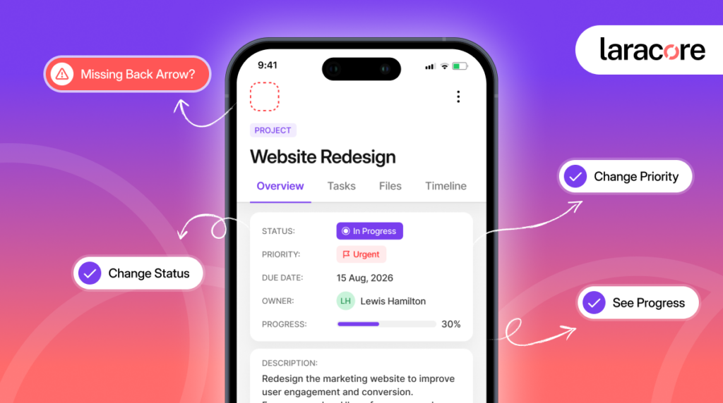
They opened a client’s profile, selected a request, reviewed the details, and then paused.
“How do I go back?”
The answer seemed obvious to the people who built the application. They knew the navigation flow. They knew which screen came before this one.
The user didn’t.
There was no visible back arrow.
Technically, nothing was broken.
But from the user’s perspective, the application had suddenly become confusing.
This is where many businesses misunderstand user experience.
Great UX is not always about adding another dashboard, animation, AI feature, or advanced workflow. Sometimes, the difference between a smooth product and a frustrating one is a feature so small that nobody notices it until it disappears.
Navigation remains one of the most important usability principles in digital products. According to the World Wide Web Consortium (W3C), consistent navigation helps users predict how an interface behaves and reduces the effort required to move between screens. This is one of the reasons why familiar elements such as back arrows continue to play an important role in modern applications.
A back arrow.
An undo option.
A loading indicator.
A useful error message.
These are small details. But together, they determine whether users feel in control of an application or feel like they are fighting it.
Why Small UX Features Have a Big Impact
Users do not experience an application the way developers build it.
Developers understand the architecture behind the screen. Users only understand what they can see.
When someone clicks a button, they expect a response. When they make a mistake, they expect a way to recover. When they move between screens, they expect to understand where they are and how to return.
The W3C’s accessibility guidance emphasizes predictable and consistent navigation because users rely on familiar placement and behavior to find their way through an interface.
That principle applies far beyond accessibility compliance.
A consistent back button does not need an explanation.
Users already know what it means.
The same applies to other familiar UX patterns:
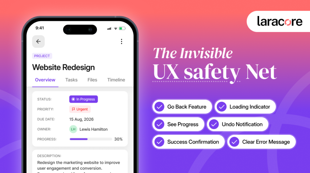
- Undo tells users that mistakes are recoverable.
- Loading states tell users that the system is still working.
- Clear error messages explain what went wrong.
- Consistent navigation reduces the need to relearn the interface.
- Confirmation messages reassure users that an action was successful.
These features do not usually appear in a product roadmap as major innovations.
But they often determine how the product feels.
The Difference Between a Working App and an Intuitive App
A feature can work perfectly and still create a poor experience.
Imagine submitting a form and seeing:
“Something went wrong.”
Research from the Baymard Institute shows that unclear validation and generic error messages continue to create friction during critical user journeys. Their usability studies found that users are far more likely to recover from mistakes when applications provide immediate, specific, and actionable feedback.
The system may have technically detected the error. But the user is left with several questions:
What went wrong?
Which field caused it?
Do I need to start again?
Did my information disappear?
A useful error message removes that uncertainty.
Research from the Baymard Institute found that 31% of benchmarked sites had no inline validation, creating unnecessary friction when users entered incorrect information. Their usability testing also highlights how timely validation can help users identify and correct problems before submission.
The W3C similarly recommends that when an input error is detected, the user should be told which item is wrong and what the error is.
The lesson is simple:
An error message should help users recover, not simply inform them that they failed.
Small Features That Give Users a Sense of Control
The best interfaces quietly answer questions before users have to ask them.
1. A Clear Back Arrow
Users should not have to guess how to return to the previous screen.
A visible and consistently placed back action helps maintain orientation, especially in multi-step flows.
2. Undo Instead of Permanent Mistakes
Deleting something accidentally should not always feel final.
An undo option creates confidence. Users are more comfortable taking action when they know a small mistake is reversible.
3. Loading States That Communicate
A blank screen can look like an error.
A spinner, skeleton screen, or simple “Loading…” message tells users that the application is responding.
The goal is not to make waiting enjoyable.
It is to make waiting understandable.
4. Error Messages That Explain the Problem
“Invalid input” is technically correct but rarely helpful.
“Please enter a valid business email address” gives the user a clear next step.
The difference is small in terms of development effort.
The difference in usability can be significant.
5. Confirmation That an Action Worked
After submitting a form, updating a profile, or completing a payment, users need feedback.
A short confirmation message can remove the uncertainty of:
“Did that actually work?”
Small UX Problems Become Bigger Business Problems
One missing back arrow might not cause a customer to leave.
One unclear error message might not destroy a product.
But UX problems rarely exist alone.
They accumulate.
A confusing login.
A slow-loading screen with no feedback.
A form that clears after an error.
A button that does not confirm success.
A user eventually stops thinking, “This feature is confusing.”
The Nielsen Norman Group, one of the most respected UX research organizations, identifies user control and freedom as one of the fundamental principles of usability. Users expect the ability to navigate backward, recover from mistakes, and maintain control throughout their interaction with a product. When these expectations aren’t met, frustration increases quickly.
They start thinking:
“This app is difficult to use.”
That distinction matters.
When businesses invest in custom web application development, UX details should not be treated as something to fix after the main features are complete.
They should be part of how the product is built.
A skilled Frontend Developer can build the functionality behind a feature. But successful product development also requires asking what happens before, during, and after the user interacts with it.
What if they change their mind?
What if the request takes longer than expected?
What if something fails?
What if they want to go back?
Those questions often uncover the small features that prevent much larger frustrations.
UX Is Often About Reducing Uncertainty
The best user experience does not constantly demand attention.
It feels natural.
Users know where they are. They understand what happened. They know what to do next.
That is why small UX decisions matter.
A clear back arrow says:
You are not stuck.
An undo button says:
You can recover from a mistake.
A loading state says:
The system is working.
A useful error message says:
Here is what happened and how to fix it.
These are not advanced features.
But they are signals that the product was designed with the user’s experience in mind.
The Question Worth Asking Before Your Next Release
Before adding another major feature, look at the features you already have.
Ask:
- Can users easily go back?
- Do they know when something is loading?
- Can they recover from mistakes?
- Are error messages actually useful?
- Do they know when an action has succeeded?
- Does navigation behave consistently across the application?
Sometimes the biggest improvement does not require building something entirely new.
Sometimes, it requires noticing what is missing.
Build Products That Feel Effortless
At Laracore, we believe successful Web Application Development is not only about building features that work. It is about building products that people can use confidently.
Our Frontend Development Services focus on the complete product experience—from application logic and scalable architecture to the small interactions that make software feel intuitive.
If your application works but does not always feel effortless to use, hire dedicated web developers who look beyond functionality and help build experiences designed around real users.
Let’s build a web application that not only works—but feels right.

With over 12+ years of experience shaping high-performing web and Laravel platforms, Faheem brings strategic expertise and proven stability to enterprise technology environments. At Laracore, he leads the delivery of scalable, performance-driven Laravel solutions designed to support long-term growth and global business demands.